On this page
Astris Dynamics
Brand Identity Overview
Name Meaning: "Astris" evokes space, stars, and innovation; "Dynamics" implies motion, technology, and adaptability. Combined, the name represents forward-thinking, scalable solutions powered by technology.
Industry: SaaS / Web Development / Software Engineering / Automation
Style Direction:
-
Modern, tech-forward, minimalistic.
-
Futuristic geometric typography with soft edges.
-
Possible integration of a celestial or orbital motif (symbolizing reach, systems, or connectivity).
-
Flexible enough to use on websites, software dashboards, and hardware.
Color Palette:
-
Primary: Deep Space Blue (#0A0F1C)
-
Accent: Electric Cyan (#00D4FF)
-
Secondary: Silver Grey (#B0BEC5)
-
Optional highlight: Cosmic Purple (#8E2DE2)
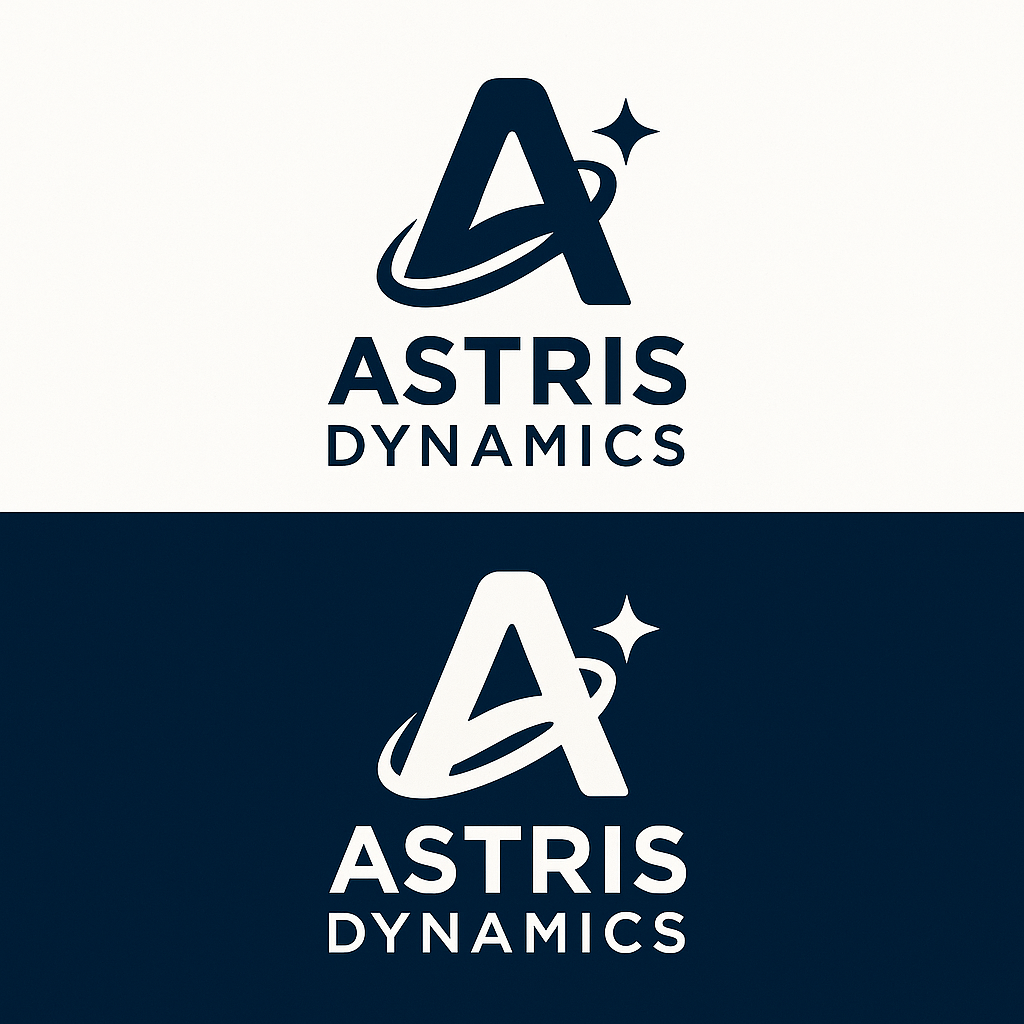
Logo Concepts:
-
Astral Orbit Mark: A stylized "A" formed by orbital rings or intersecting arcs, symbolizing innovation and systems working in harmony.
Typography Pairings
Primary Font — “Rajdhani” (Bold)
-
Usage: Logo wordmark, main headers, and navigation menus.
-
Style: Geometric, futuristic, technical — perfectly complements the orbital “A” mark.
-
Backup: Orbitron or Exo 2 (if you prefer a more angular or sleek variant).
-
Example:
Secondary Font — “Inter” (Regular / Medium)
-
Usage: Website body text, app interface labels, and documentation.
-
Style: Clean, highly legible for web and SaaS dashboards.
-
Example:
Accent Font — “Space Grotesk” or “Poppins” (Medium)
-
Usage: Callouts, metrics, or tagline emphasis.
-
Style: Rounded geometric contrast to Rajdhani’s angular tech tone.
Font Pairing Summary
| Use Case | Font | Weight | Color |
|---|---|---|---|
| Logo / Header | Rajdhani | Bold | #FFFFFF (on dark) / #0A0F1C (on light) |
| Navigation / Buttons | Rajdhani | Semi-Bold | Accent #00D4FF |
| Body / Docs | Inter | Regular / Medium | Neutral Grey #B0BEC5 |
| Emphasis / Stats | Space Grotesk | Medium | Electric Cyan #00D4FF |
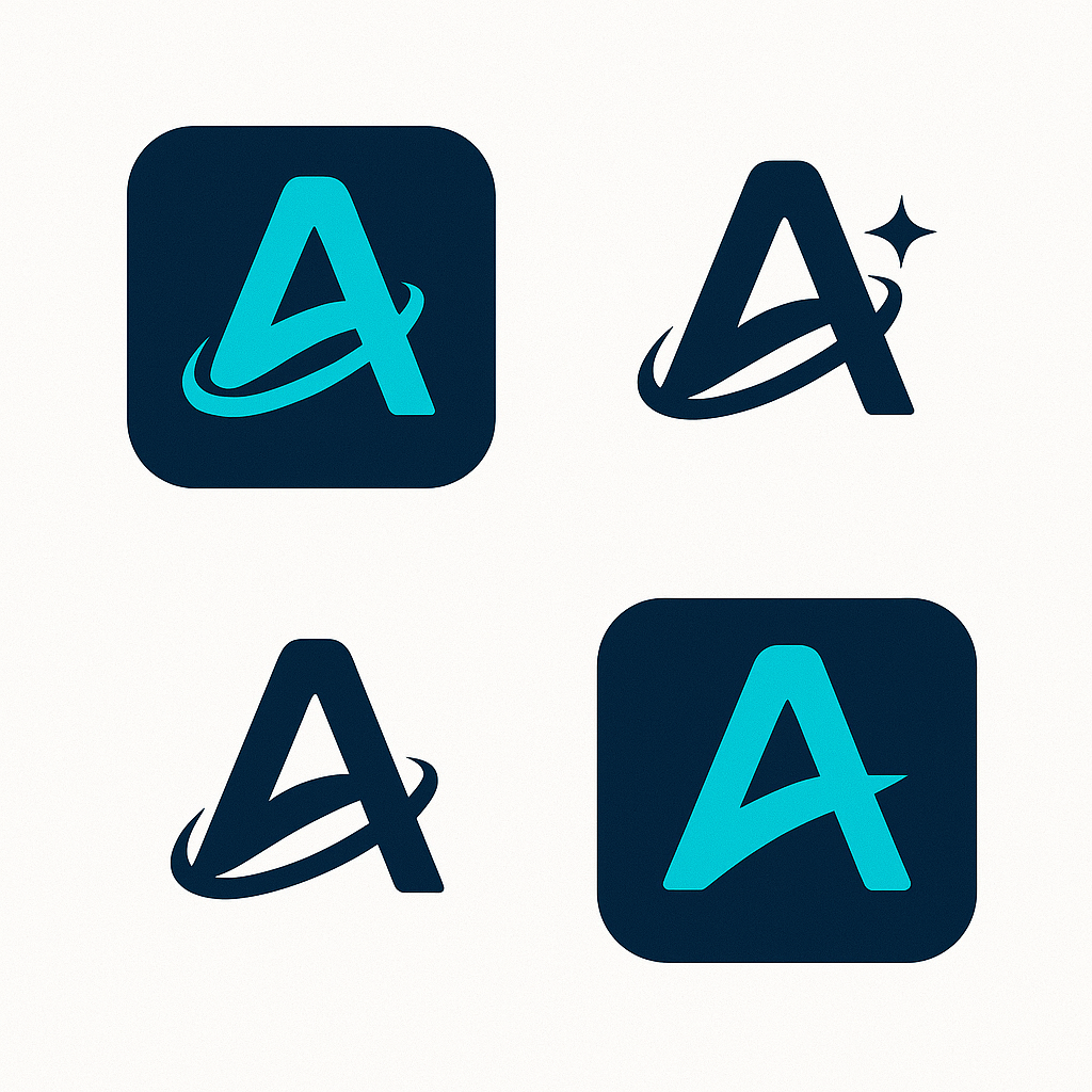
Favicon and App Icon Set
Base Design:
Derived from the Astral Orbit “A” mark — clean, bold, with orbital ring retained for recognition even at small scale.
Variants:
-
Favicon (16×16 / 32×32): Simplified “A” with orbit, no text, solid Electric Cyan on Deep Space Blue background.
-
App Icon (512×512): Centered “A” orbit symbol with soft glow effect; can include subtle gradient from
#0A0F1C→#001F33. -
Monochrome Variants:
-
Light mode: Navy blue on white.
-
Dark mode: White on navy.
-
-
Rounded & Square Masks: for iOS and Android apps.
File Output Recommendations
-
Logo Files: SVG, PNG (light/dark/transparent)
-
Typography Kit: Google Fonts (Rajdhani, Inter, Space Grotesk)
-
Favicon & App Icons:
-
/favicon.ico -
/icons/icon-192x192.png -
/icons/icon-512x512.png -
/apple-touch-icon.png
-